Wedding Wednesday: Website
Posted on March 2nd, 2016
It is a common trope that in planning a wedding the bride manages all of the details. The groom’s eyes glaze over as she asks him about preferences on flowers, colors, and invitations. Frankly, this wedding is no exception, but there is one piece of the wedding that Ian, a software developer at Microsoft, could not wait to tackle: the wedding website.

A master at work.
It turns out Ian bought the URL for our website, nightingalenuptials.com, well before he proposed because he wanted to make sure it wouldn’t be used by anyone else. He’s lucky I said yes, otherwise that $10 would have been a total waste 😉
Wedding websites are like cell phones: 15 years ago, almost no one had one, but now we cannot imagine doing without. They’re such an awesome way to convey information to guests more subtly than dumping it all in the invitation or trying to rely on word of mouth.
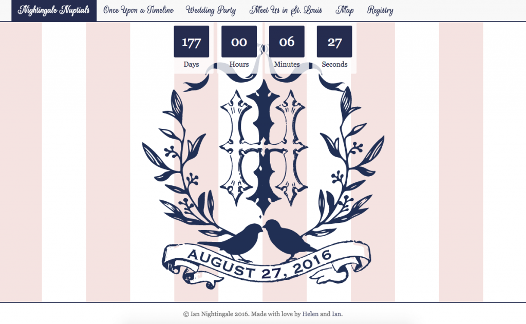
We are using ours to check off some administrative boxes– where our hotels are set up, the map of our key wedding day locations, etc. But we also tried to add an element of fun! We built a timeline that chronicles our relationship since 2002 with an honest tone, and we introduced our bridal party with silly photos and a little bit of background information.
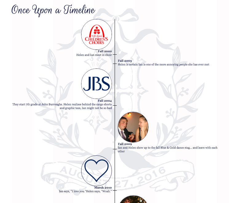
Thanks to our girls at Nico & Lala, we were able to keep the website theme 100% consistent with our stationery suite. It’s nice to have these common threads connecting the wedding aesthetic. You may notice A Cultured Pearl got in on the branding, too!
I’m totally biased, but I think Ian did a wonderful job. As for the rest of the wedding? It’s up to me.

Comments