Okay It’s All White with Me
Posted on July 19th, 2016
As I mentioned yesterday, we moved into a new apartment (four whole blocks away!) during the last week of June. Our new apartment is gorgeous, but the wall colors didn’t really jibe with our decor. I very much viewed our last apartment like a rental, leaving the walls beige and brown, but I really wanted to make this place feel like home, so Ian encouraged me to do more to make it reflect out style. Painting was a great way to set the tone!
Other than choosing an outrageous tangerine accent wall in my childhood bedroom, this was my first real experience with paint color selection. We had a few atypical circumstances that provided some constraints:
- Our apartment is actually a condo that we are renting directly from the owners. While we are so grateful to them for allowing us to paint at all, we needed to get their approval on color choices, and needed our colors to work for potential future tenants, too.
- Seattle is DARK in the winter. Since it is so far north, the sun sets well before 5pm, and we can go weeks in thick gray clouds without actually seeing the sun at all.
- We did not start over from scratch on furniture– any design choices we make have to mesh with our blue couch and rich wooden table.
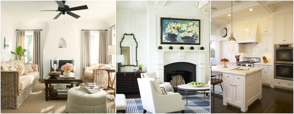
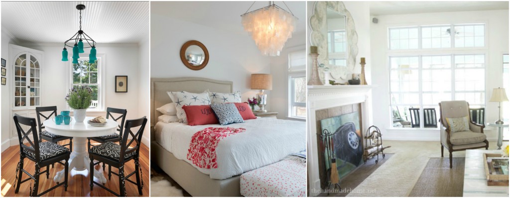
Combining these various elements pretty much left us with one obvious choice: white.
I’m sure anyone living in a Manhattan rental, where white paint is the one and only truth and seen as endlessly boring, will laugh at our choice. And I’m sure anyone who knows me will be surprised, given my love for vibrant color knows no bounds. But at the end of the day, light reflection was most important to me, and nothing does the trick quite like white.
But did you know there are 1 zillion shades of white paint?? Thankfully, the amazing designers with whom I’m working gave me a list of their best tried and true white paints. From there, we narrowed it down to two Benjamin Moore shades.
The first was White Dove. A shade that “conveys a lightness of spirit” (House Beautiful), White Dove is “clean, calm, and a great backdrop for art.” The problem? It conveys “a very faint taupe cast” (Doty Horn). Taupe is suspiciously close to beigey gray, which is suspiciously close to a dreary Seattle winter. Nix. A good contestant though!
Chantilly Lace stole our hearts! And how could it not with superlatives like these:
“As delicate and refined as the lace it was named after, this crisp, clean white evokes images of pure silk, soft linen and simpler times.”
“You can’t go wrong with the white.”
“Stays nice and happy and fresh”
That last one is just what I need in my life. Our local Benjamin Moore store was able to recommend a painter who started the very next day, and I have never been so happy to not see color.
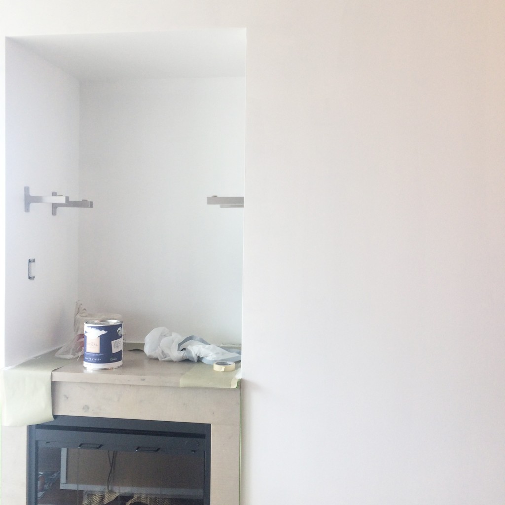
A clean slate in every sense of the word! Stay tuned to see more updates as we mold these white walls into a cozy, colorful home.


Comments