Wedding Wednesday: Invitation Acclamation
Posted on July 27th, 2016
When we started this event design process with Nico & Lala, I knew we wanted to balance two classic prints that are near and dear to my heart: stripes and toile. Our Save the Date introduced those elements to our guests right off the bat, and it was our chance to be whimsical and have a little fun. We had stickers, we had a die cut, we had a hidden message on our liner, and we had a full plate of print.
But when it came to the wedding invitation, I wanted the design to drift a bit back towards the traditional. The way Nicole and Lauren honored that sentiment while maintaining the key aesthetic elements of our event made me literally squeal in joy. (Really. There are witnesses.)
Take one look, and I’m sure you’ll agree…
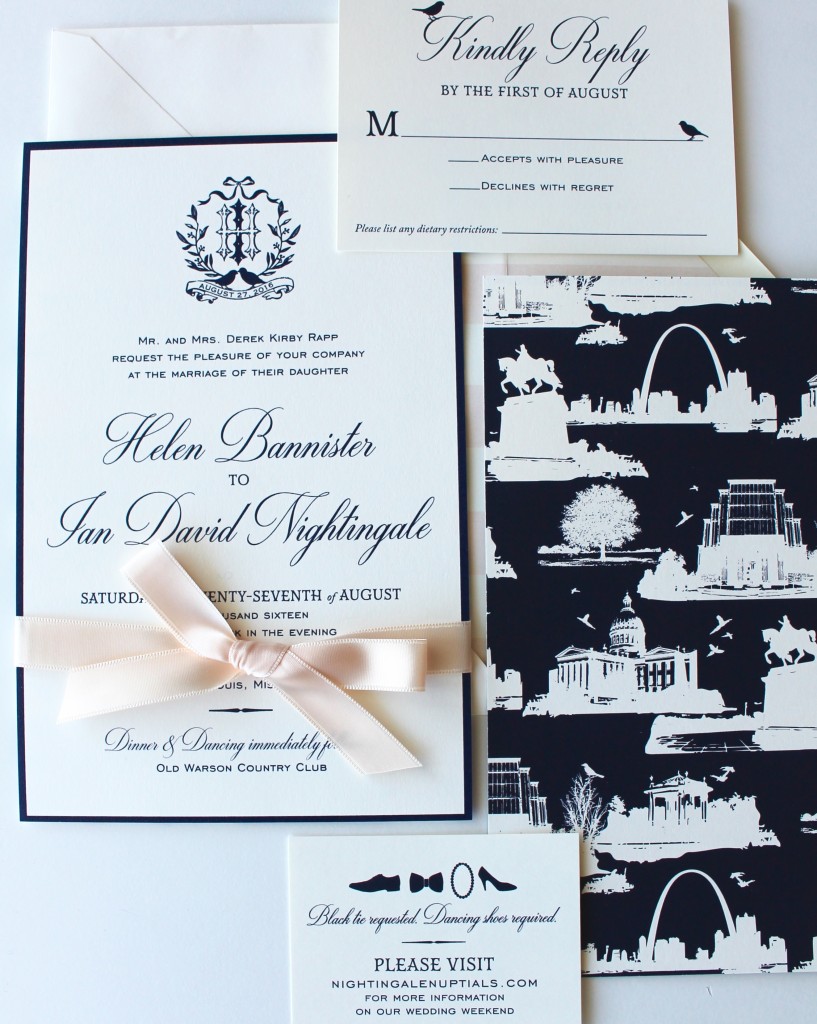
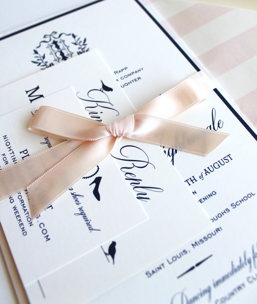
Be still, my beating heart.
A few little details that make our design complete and us:
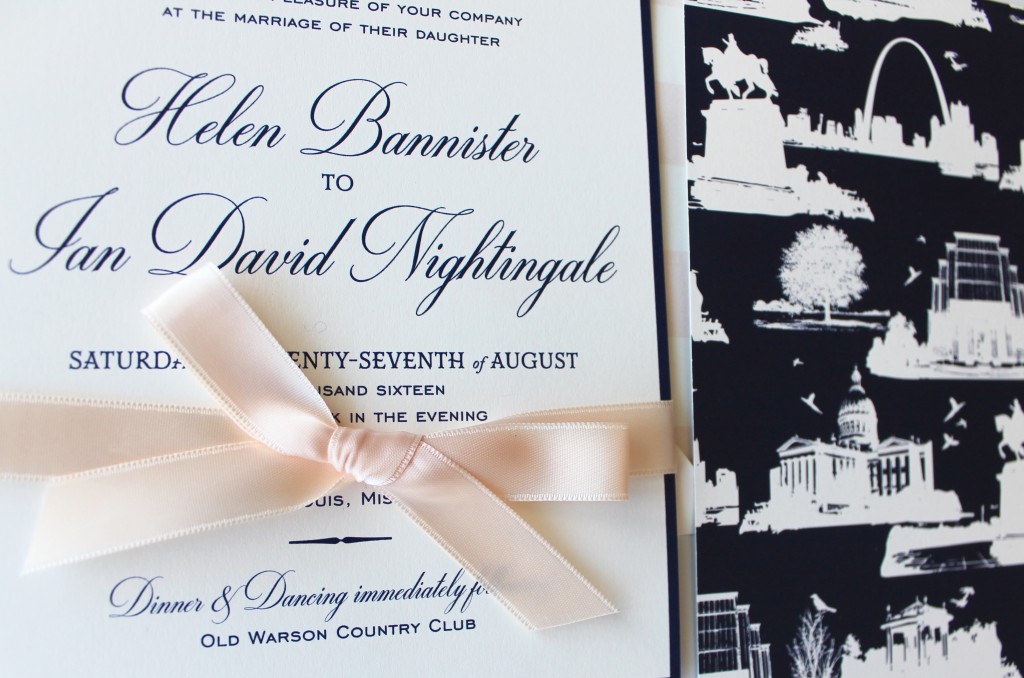
- The ribbon closure. I’ve always been a bows and ribbons kind of girl– it’s on our crest, too– and having the satin ribbon accent that was so representative of our classic tendencies and my personal taste felt perfect.
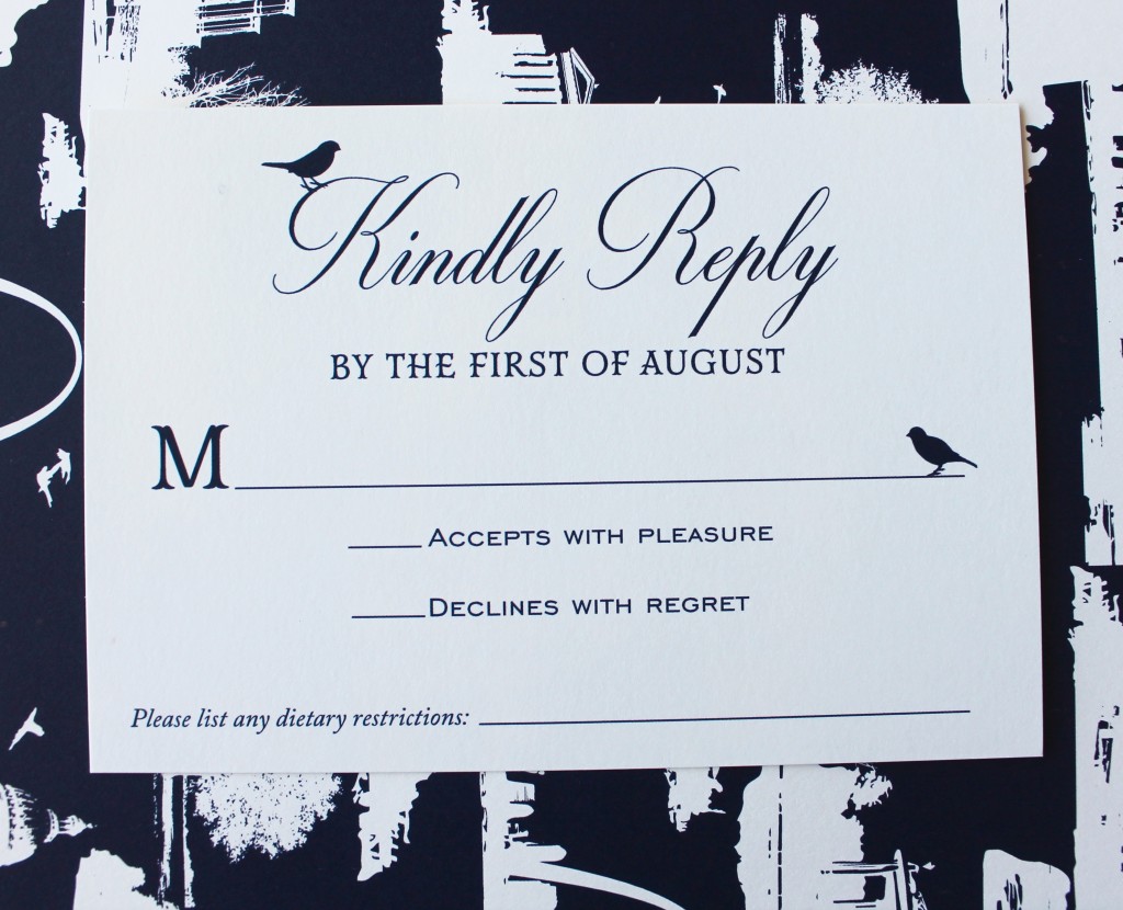
- Nightingales on the lettering. I expect we’ll see more of this touch brought through in a few other wedding design elements, but it’s a perfect little way to highlight the dual Nightingales/Lovebirds.
- The St. Louis toile. Our hometown continues to mean SO much to us. The way they captured it in a custom version of my favorite pattern really moves me. To keep the look understated, it just appears on the back of the invitation, a little personal pop of print.
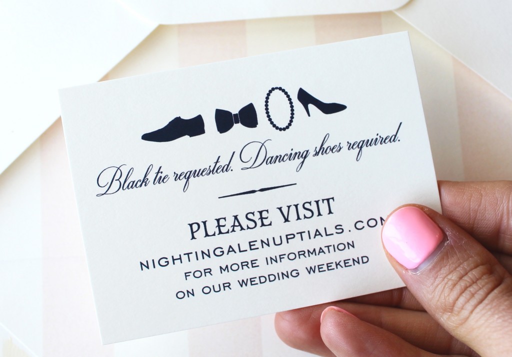
- A slightly cheeky missive. Some guests are excited by the opportunity to dress formally for a black tie wedding, but for others, a black tie wedding can be intimidating. We tried to keep the mood light with a little illustration and an instruction that makes it clear that you can (and will!) have fun in a tux.
- Thermography printing. Okay, so imagine you’re reaching your hand through the computer screen and stroking the invitation. You would notice that the printing on the invitation feels vaguely three dimensional, with the logo/text/border slightly raised. I always liked the look and feel of embossed and engraved invitations, but when I started researching printing styles for our own suite, I realized I liked thermography even more. Which is handy, because since it skips the plate-making process, it is considerably more budget friendly!
We all have little things that we are probably too invested in, and paper products are one of mine. I love that opening an invitation is a glimpse into the world you will be creating for your guests. And in this case, I love the idea that their excitement and anticipation is stemming from a first impression that is so personal, so thoughtful, and so befitting the tone we’re setting.
Comments